User Experience
Using data and empathy to engage and delight
My user experience process is informed by extensive work in information-dense environments, such as higher education. I spend time with users in focus groups and interviews, digging deep to find out what they need to do, both on the web and outside of it. Similarly, I sit down with leadership and key stakeholders, drawing out the broader goals and encouraging the view of the website as a tool towards a larger end, rather than an isolated project.
PROGRAM SORTER
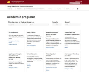
SITUATION: With 78 academic programs and certificates, students had a hard time navigating the opportunities in the college. Both undergraduate and graduate students wanted a way to understand how degrees linked to specific jobs, but the fixed degree and department names made this difficult to do from a large list of options.
College leadership wanted a way to promote smaller programs for more growth, and to highlight programs with common job outcomes. Teacher education licensing programs are only offered at a post-baccalaureate level, leaving many undergrads thinking no teacher education programs were available in the college.

SOLUTION: Following comparative research from dozens of comparable universities and colleges, I developed a tool to “sort” programs. This incorporated categories for users to filter by degree level or field of interest. In user testing, students often expressed surprise at the breadth of programs offered, and through filtering both found programs that interested them, and comparable new opportunities to explore.
The sorter also revealed similarities in departments and programs that had previously been unnoticed. A student who wanted to work with children, for example, may naturally gravitate to the Institute of Child Development. When filtering degrees in the sorter, however, opportunities such as Youth Studies and Family Social Science would also appear.
The sorter has visual elements that show the user’s actions; hovering and clicking provide instant feedback. The amount of, and type of, text in each card needed to be restricted, informative, and consistent to provide comparisons. Visual cues allowed users to see that the number of programs being sorted through their selection process.
College Homepage & Navigation

SITUATION: While search engine traffic often has users skipping over the college’s homepage altogether, it remains a hotbed of feelings and politics. User testing revealed students hovering through navigation drop downs to orient themselves to the site, and jumping in as soon as they found a relevant-sounding page.
Focus groups revealed that students weren’t interested in seeing what classrooms looked like. They want to see what its like to “go here”, what it’s like to be on campus, who their friends would be, and where they would hang out.
While the internal politics over a person “featured on the homepage” could rise to a fever pitch, students paid it little attention, rarely clicking through and putting more value on images of the campus itself.
SOLUTION:
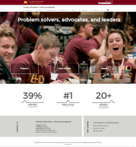
The homepage features full-width background videos carefully shot and edited to create an immediate response. Five full-width videos of 5-7 seconds each cycle through the background of the homepage. These are carefully shot and edited to evoke responses nuanced to the primary user groups, undergraduate and graduate students. Undergraduates are usually seen in dynamic, outdoor shots, while graduate students are featured in calmer interiors. New videos are easily added to the cycle, allowing the page to reflect the academic calendar and the vibrancy of campus life throughout the year.

Comparing analytics between new site (launched in 2017) and the previous site (2013-2017) revealed 800% increase in clicks from homepage to the news page. Traffic from the home page to the program sorter was a whopping 23,000 in one year which is a higher number than expected.
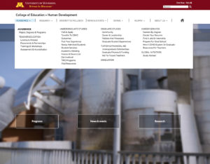
I researched navigation solutions employed by other info-dense industries (e.g. public and private academic institutions, B to B, and B to C sites), looking for inspiration for our complex information structure. A “meganav” solution, with broad drop-down categories, easily framed the context of our content, as well as accommodating observed user browsing habits. While some areas such as “Academics” were naturally dense, the navigation drop-downs for other areas like “Research” and “Giving” had room for a feature story.